Tools Library:
A collection of base code to use for visualizations:
Preferred Color Palettes
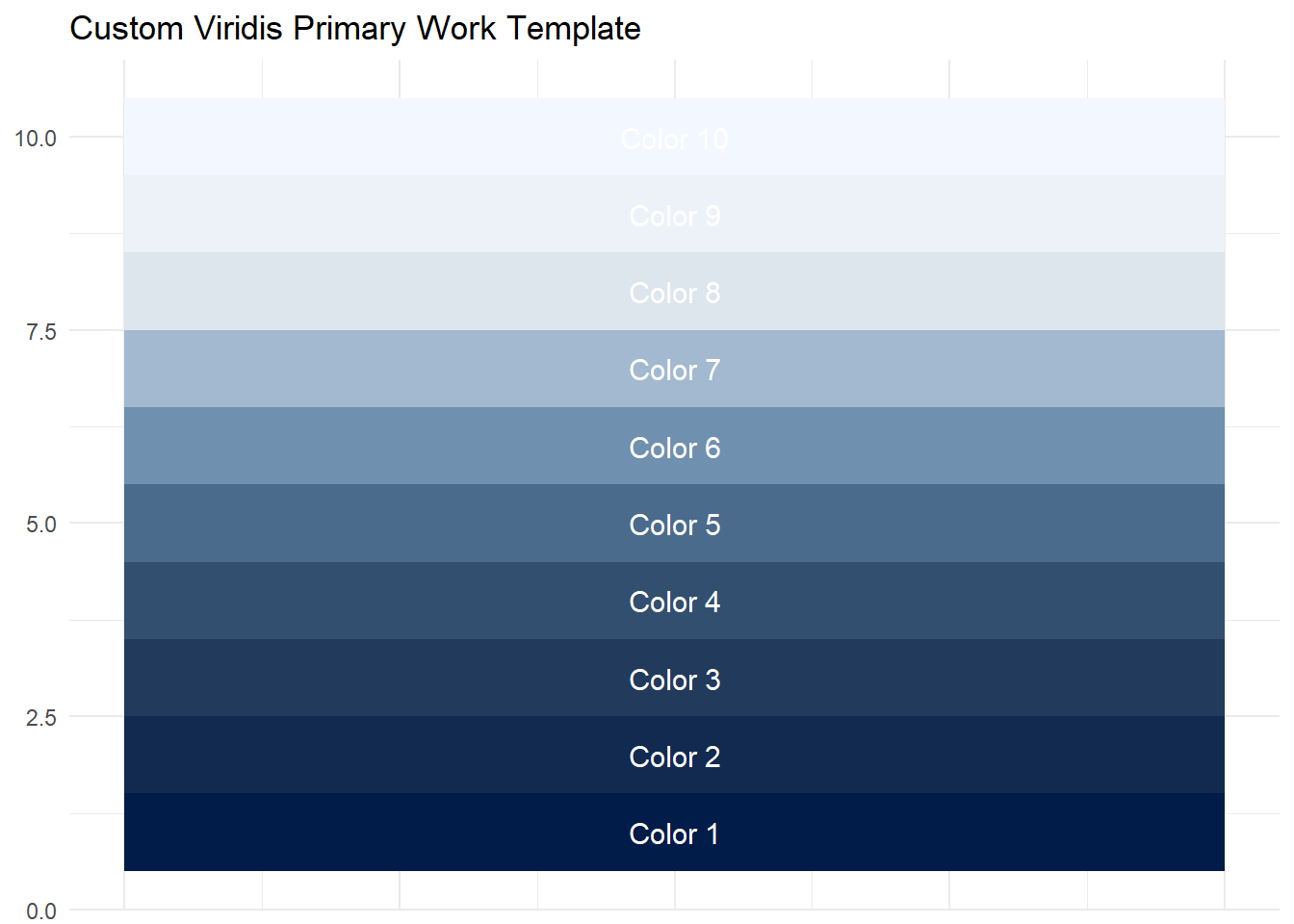
For work, I primarily use the below color pallette for its uniformity and ease of integration.
Loading required package: viridisLite
Warning: package 'ggplot2' was built under R version 4.5.2
# Custom viridis-primary work palette (you can change these 3 colors)
work_viridis <- colorRampPalette(c("#021C49","#1F3657","#3C5C7C", "#7FA0C0", "#E9EEF3", "#F3F7FF"))

# Generate 10 example colors (change to any number you want)
colors <- work_viridis(10)

# Create dataframe for tile chart
df <- data.frame(
  name = paste0("Color ", 1:10),
  fill = colors,
  x = 1,
  y = 1:10
)

# Tile chart
ggplot(df, aes(x, y, fill = fill)) +
  geom_tile() +
  geom_text(aes(label = name), color = "white", size = 4) +
  scale_fill_identity() +
  labs(title = "Custom Viridis Primary Work Template") +
  theme_minimal() +
  theme(
    axis.title = element_blank(),
    axis.text.x = element_blank(),
    axis.ticks = element_blank()
  )
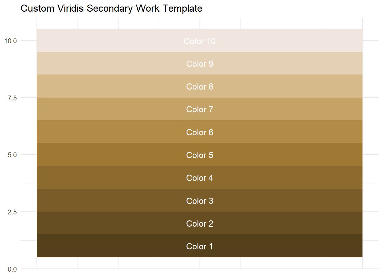
In cases at work where I need more contrast within a plot, I will also use the below palette:
library(viridis)
library(ggplot2)

# Custom viridis-secondary work palette (you can change these 3 colors)
work2_viridis <- colorRampPalette(c("#55401C", "#7f602A", "#A98038","#D4B57F","#F1E6Df"))

# Generate 10 example colors (change to any number you want)
colors <- work2_viridis(10)

# Create dataframe for tile chart
df <- data.frame(
  name = paste0("Color ", 1:10),
  fill = colors,
  x = 1,
  y = 1:10
)

# Tile chart
ggplot(df, aes(x, y, fill = fill)) +
  geom_tile() +
  geom_text(aes(label = name), color = "white", size = 4) +
  scale_fill_identity() +
  labs(title = "Custom Viridis Secondary Work Template") +
  theme_minimal() +
  theme(
    axis.title = element_blank(),
    axis.text.x = element_blank(),
    axis.ticks = element_blank()
  )