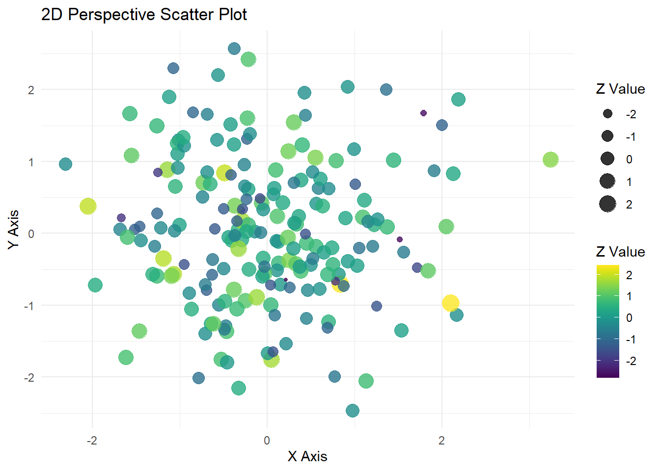
This plot is made using ggplot2 and viridis to give the plot a clean look. No real data is being used in the plot.
# Install packages if needed# Load librarieslibrary(ggplot2)
Warning: package 'ggplot2' was built under R version 4.5.2
library(viridis)
Cargando paquete requerido: viridisLite
# Example dataset.seed(123)data <-data.frame(x =rnorm(200),y =rnorm(200),z =rnorm(200) # this will control color/size for perspective effect)# Perspective-like scatter plotggplot(data, aes(x = x, y = y, color = z, size = z)) +geom_point(alpha =0.8) +# points with transparencyscale_color_viridis(option ="D") +# viridis color scalelabs(title ="2D Perspective Scatter Plot",x ="X Axis",y ="Y Axis",color ="Z Value",size ="Z Value" ) +theme_minimal()
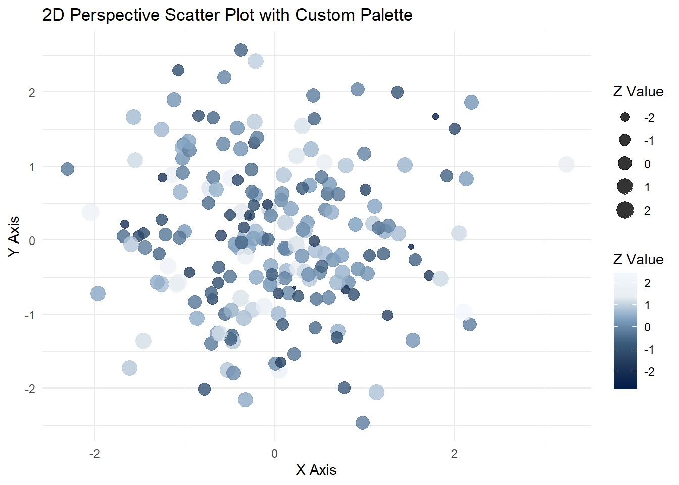
Plot with Work Color Palette:
For work, I incorporate a custom palette for my plots.
library(ggplot2)# Example dataset.seed(123)data <-data.frame(x =rnorm(200),y =rnorm(200),z =rnorm(200) # this will control color/size for perspective effect)# Your custom palettework_viridis <-colorRampPalette(c("#021C49","#1F3657","#3C5C7C","#7FA0C0", "#E9EEF3", "#F3F7FF"))custom_colors <-work_viridis(256) # generate 256 colors# Perspective-like scatter plot with custom paletteggplot(data, aes(x = x, y = y, color = z, size = z)) +geom_point(alpha =0.8) +# points with transparencyscale_color_gradientn(colors = custom_colors) +# use custom palettelabs(title ="2D Perspective Scatter Plot with Custom Palette",x ="X Axis",y ="Y Axis",color ="Z Value",size ="Z Value" ) +theme_minimal()
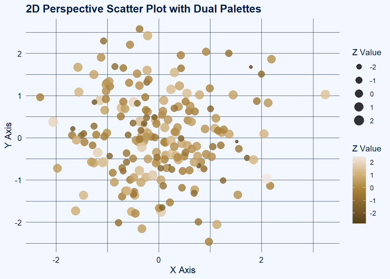
Plot with Primary & Secondary Work Palettes to Create Contrasts:
library(ggplot2)# Example dataset.seed(123)data <-data.frame(x =rnorm(200),y =rnorm(200),z =rnorm(200) # this will control color/size for perspective effect)# Theme palettework_viridis <-colorRampPalette(c("#021C49","#1F3657","#3C5C7C","#7FA0C0", "#E9EEF3", "#F3F7FF"))theme_colors <-work_viridis(256)bg_light <- theme_colors[256] # light backgroundline_dark <- theme_colors[1] # dark text/lines# Data palettework2_viridis <-colorRampPalette(c("#55401C", "#7f602A", "#A98038","#D4B57F","#F1E6Df"))data_colors <-work2_viridis(256)# 2D Perspective-like scatter plotggplot(data, aes(x = x, y = y, color = z, size = z)) +geom_point(alpha =0.8) +scale_color_gradientn(colors = data_colors) +# data points use work2_viridislabs(title ="2D Perspective Scatter Plot with Dual Palettes",x ="X Axis",y ="Y Axis",color ="Z Value",size ="Z Value" ) +theme_minimal() +theme(plot.background =element_rect(fill = bg_light, color =NA),panel.background =element_rect(fill = bg_light, color =NA),panel.grid.major =element_line(color = line_dark, linewidth =0.3),panel.grid.minor =element_line(color = line_dark, linewidth =0.1),axis.title =element_text(color = line_dark, size =12),axis.text =element_text(color = line_dark, size =10),plot.title =element_text(color = line_dark, size =14, face ="bold"),legend.title =element_text(color = line_dark),legend.text =element_text(color = line_dark) )
Base 3D Plot:
This plot is made using ggplot2 and viridis to give the plot a clean look. No real data is being used in the plot.
# Install packages if needed# Load librarieslibrary(plotly)
Warning: package 'plotly' was built under R version 4.5.2
Adjuntando el paquete: 'plotly'
The following object is masked from 'package:ggplot2':

    last_plot
The following object is masked from 'package:stats':

    filter
The following object is masked from 'package:graphics':

    layout
library(viridis)# Example dataset.seed(123)data <-data.frame(x =rnorm(200),y =rnorm(200),z =rnorm(200))# Generate a viridis color palette based on zcolors <-viridis(200)# 3D Scatter Plotplot_ly( data, x =~x, y =~y, z =~z, type ="scatter3d", mode ="markers",marker =list(size =5,color =~z, # color by zcolorscale ='Viridis', # viridis colorscaleshowscale =TRUE )) %>%layout(scene =list(xaxis =list(title ="X Axis"),yaxis =list(title ="Y Axis"),zaxis =list(title ="Z Axis") ),title ="3D Scatter Plot with Viridis Colors" )
Plot with Work Color Palette:
For work, I incorporate a custom palette for my plots.
library(plotly)# Example dataset.seed(123)data <-data.frame(x =rnorm(200),y =rnorm(200),z =rnorm(200))# Custom theme palettework_viridis <-colorRampPalette(c("#021C49","#1F3657","#3C5C7C","#7FA0C0", "#E9EEF3", "#F3F7FF"))custom_colors <-work_viridis(256) # generate 256 colors# Convert palette to Plotly colorscale formatplotly_colorscale <-lapply(seq_along(custom_colors), function(i) {c((i-1)/(length(custom_colors)-1), custom_colors[i])})# 3D Scatter Plot with custom colorscaleplot_ly( data, x =~x, y =~y, z =~z, type ="scatter3d", mode ="markers",marker =list(size =5,color =~z, # color by zcolorscale = plotly_colorscale, # use custom paletteshowscale =TRUE )) %>%layout(scene =list(xaxis =list(title ="X Axis"),yaxis =list(title ="Y Axis"),zaxis =list(title ="Z Axis") ),title ="3D Scatter Plot with Custom Theme Palette" )
Plot with Primary & Secondary Work Palettes to Create Contrasts:
library(plotly)# Example dataset.seed(123)data <-data.frame(x =rnorm(200),y =rnorm(200),z =rnorm(200))# Theme palette (for background, grids, axes)work_viridis <-colorRampPalette(c("#021C49","#1F3657","#3C5C7C","#7FA0C0", "#E9EEF3", "#F3F7FF"))theme_colors <-work_viridis(256)bg_light <- theme_colors[256] # light backgroundline_dark <- theme_colors[1] # dark axes/grid lines# Data palette (for points)work2_viridis <-colorRampPalette(c("#55401C", "#7f602A", "#A98038","#D4B57F","#F1E6Df"))data_colors <-work2_viridis(256)# Convert data palette to Plotly colorscale formatdata_colorscale <-lapply(seq_along(data_colors), function(i) {c((i-1)/(length(data_colors)-1), data_colors[i])})# 3D Scatter Plot with dual palettesplot_ly( data, x =~x, y =~y, z =~z, type ="scatter3d", mode ="markers",marker =list(size =5,color =~z, # color by zcolorscale = data_colorscale, # use work2_viridis for pointsshowscale =TRUE )) %>%layout(scene =list(xaxis =list(title ="X Axis", backgroundcolor = bg_light, gridcolor = line_dark, linecolor = line_dark, showbackground =TRUE),yaxis =list(title ="Y Axis", backgroundcolor = bg_light, gridcolor = line_dark, linecolor = line_dark, showbackground =TRUE),zaxis =list(title ="Z Axis", backgroundcolor = bg_light, gridcolor = line_dark, linecolor = line_dark, showbackground =TRUE) ),paper_bgcolor = bg_light, # overall plot backgroundtitle ="3D Scatter Plot with Dual Palettes" )