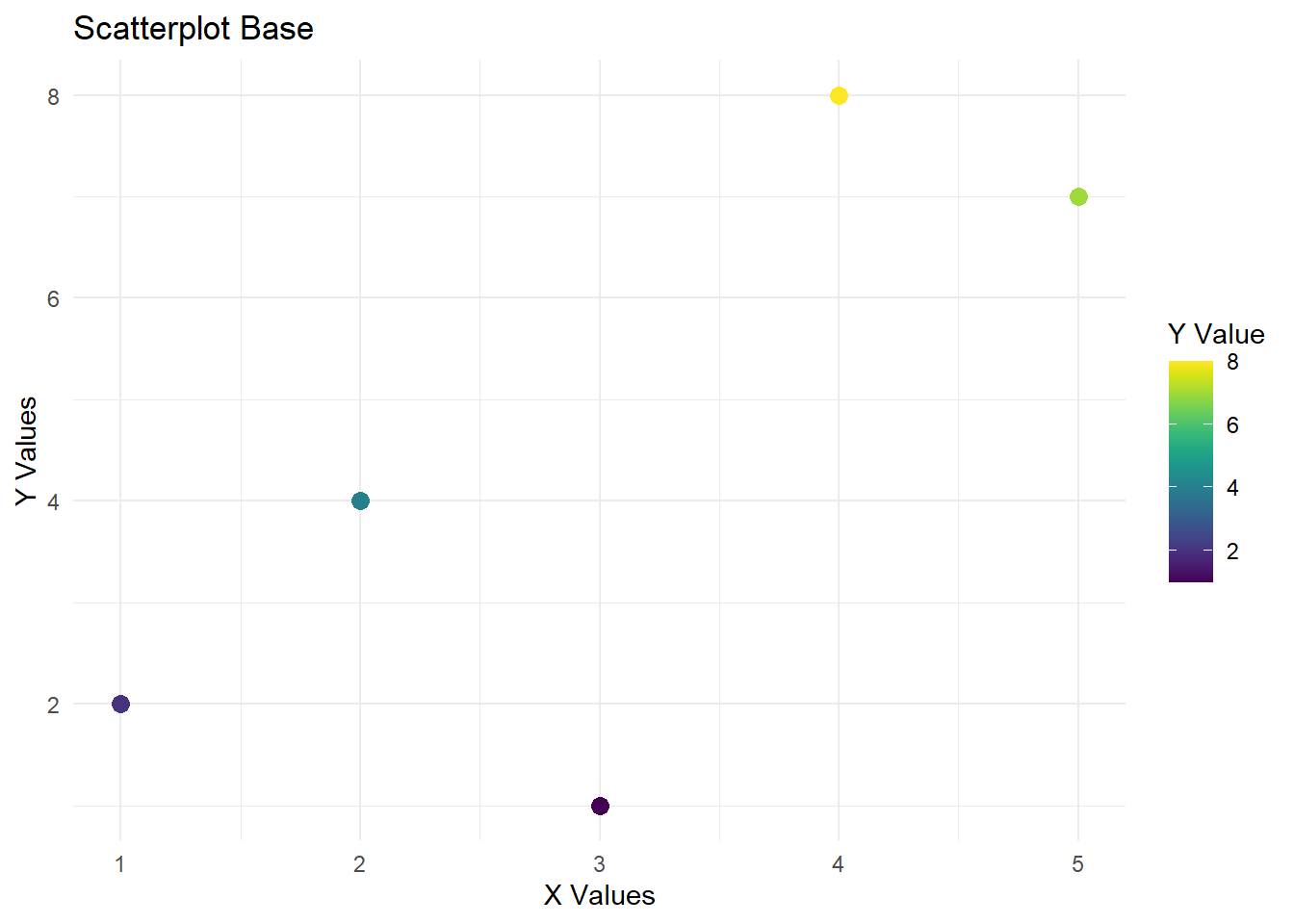
Base Plot:
This plot is made using ggplot2 and viridis to give the plot a clean look. No real data is being used in the plot.
Warning: package 'ggplot2' was built under R version 4.5.2
Cargando paquete requerido: viridisLite
df <- data.frame(
  x = c(1, 2, 3, 4, 5),
  y = c(2, 4, 1, 8, 7)
)

ggplot(df, aes(x, y, color = y)) +
  geom_point(size = 3) +
  scale_color_viridis(option = "D") +   # Or "C", "B", "A", "E", "F"
  labs(title = "Scatterplot Base",
       x = "X Values",
       y = "Y Values",
       color = "Y Value") +
  theme_minimal()
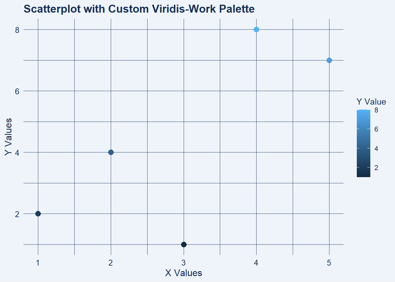
Plot with Work Color Palette:
For work, I use the below color palette for my plots.
library(ggplot2)
library(viridis)

# Your data
df <- data.frame(
  x = c(1, 2, 3, 4, 5),
  y = c(2, 4, 1, 8, 7)
)

# Your custom palette
work_viridis <- colorRampPalette(c("#021C49","#1F3657","#3C5C7C",
                                 "#7FA0C0", "#E9EEF3", "#F3F7FF"))
colors <- work_viridis(256)

# Define lighter + darker colors
bg_light  <- colors[240]   # light end for background
line_dark <- colors[40]    # dark end for axes + text

ggplot(df, aes(x, y, color = y)) +
  geom_point(size = 3) +
  labs(title = "Scatterplot with Custom Viridis-Work Palette",
       x = "X Values",
       y = "Y Values",
       color = "Y Value") +
  theme_minimal() +
  theme(
    plot.background = element_rect(fill = bg_light, color = NA),
    panel.background = element_rect(fill = bg_light, color = NA),
    panel.grid.major = element_line(color = line_dark, linewidth = 0.3),
    panel.grid.minor = element_line(color = line_dark, linewidth = 0.1),
    axis.title = element_text(color = line_dark, size = 12),
    axis.text = element_text(color = line_dark, size = 10),
    plot.title = element_text(color = line_dark, size = 14, face = "bold"),
    legend.title = element_text(color = line_dark),
    legend.text  = element_text(color = line_dark)
  )
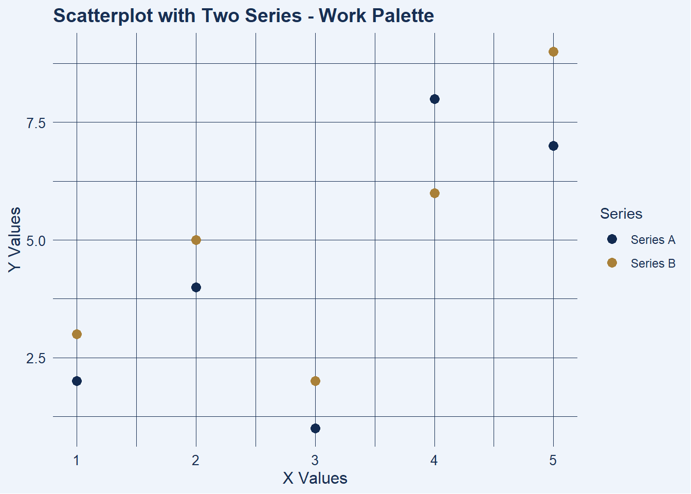
Having Two Series in the Scatterplot:
library(ggplot2)
library(viridis)

# Two-series example data
df <- data.frame(
  x  = c(1, 2, 3, 4, 5,  1, 2, 3, 4, 5),
  y  = c(2, 4, 1, 8, 7,  3, 5, 2, 6, 9),
  series = rep(c("Series A", "Series B"), each = 5)
)

# Custom palette
work_viridis <- colorRampPalette(c("#021C49","#1F3657","#3C5C7C",
                                 "#7FA0C0", "#E9EEF3", "#F3F7FF"))
colors <- work_viridis(256)

# Light and dark theme colors
bg_light  <- colors[240]
line_dark <- colors[40]

ggplot(df, aes(x, y, color = series)) +
  geom_point(size = 3) +
  scale_color_manual(values = c(
    "Series A" = colors[30],   # dark-ish
    "Series B" = "#A98038"   # Tan
  )) +
  labs(title = "Scatterplot with Two Series - Work Palette",
       x = "X Values",
       y = "Y Values",
       color = "Series") +
  theme_minimal() +
  theme(
    plot.background = element_rect(fill = bg_light, color = NA),
    panel.background = element_rect(fill = bg_light, color = NA),
    panel.grid.major = element_line(color = line_dark, linewidth = 0.3),
    panel.grid.minor = element_line(color = line_dark, linewidth = 0.1),
    axis.title  = element_text(color = line_dark, size = 12),
    axis.text   = element_text(color = line_dark, size = 10),
    plot.title  = element_text(color = line_dark, size = 14, face = "bold"),
    legend.title = element_text(color = line_dark),
    legend.text  = element_text(color = line_dark)
  )