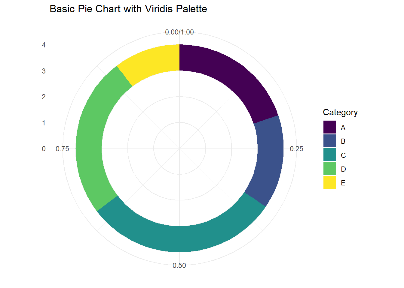
Base Pie Chart:
This plot is made using ggplot2 and viridis to give the plot a clean look. No real data is being used in the plot.
# Install packages if needed
# Load libraries
library(ggplot2)
Warning: package 'ggplot2' was built under R version 4.5.2
Cargando paquete requerido: viridisLite
# Example data
data <- data.frame(
  category = c("A", "B", "C", "D", "E"),
  value = c(23, 17, 35, 29, 12)
)

# Compute percentages for labels
data$fraction <- data$value / sum(data$value)
data$ymax <- cumsum(data$fraction)
data$ymin <- c(0, head(data$ymax, n=-1))

# Basic Pie Chart
ggplot(data, aes(ymax = ymax, ymin = ymin, xmax = 4, xmin = 3, fill = category)) +
  geom_rect() +
  coord_polar(theta = "y") +           # convert to polar coordinates
  scale_fill_viridis(discrete = TRUE, option = "D") +  # viridis palette
  xlim(c(0, 4)) +
  labs(
    title = "Basic Pie Chart with Viridis Palette",
    fill = "Category"
  ) +
  theme_minimal()                          # clean background
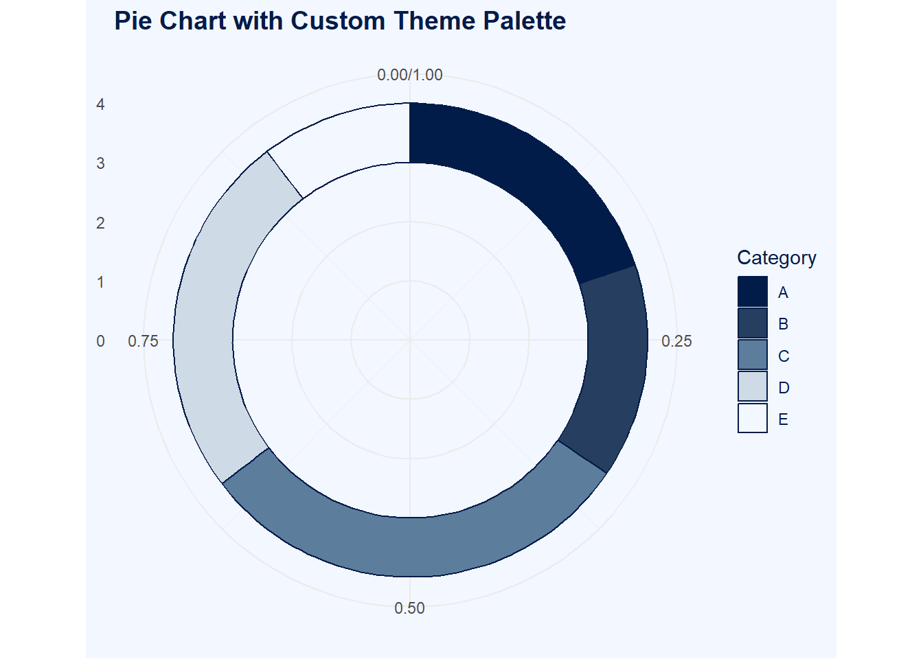
Plot with Work Color Palette:
For work, I incorporate a custom palette for my plots.
library(ggplot2)

# Example data
data <- data.frame(
  category = c("A", "B", "C", "D", "E"),
  value = c(23, 17, 35, 29, 12)
)

# Compute percentages for labels
data$fraction <- data$value / sum(data$value)
data$ymax <- cumsum(data$fraction)
data$ymin <- c(0, head(data$ymax, n=-1))

# Custom theme palette
work_viridis <- colorRampPalette(c("#021C49","#1F3657","#3C5C7C",
                                   "#7FA0C0", "#E9EEF3", "#F3F7FF"))
slice_colors <- work_viridis(nrow(data))  # one color per slice

# Pie Chart using custom palette
ggplot(data, aes(ymax = ymax, ymin = ymin, xmax = 4, xmin = 3, fill = category)) +
  geom_rect(color = "#021C49") +            # outlines in darkest color
  coord_polar(theta = "y") +                # convert to polar coordinates
  scale_fill_manual(values = slice_colors) + # apply custom palette
  xlim(c(0, 4)) +
  labs(
    title = "Pie Chart with Custom Theme Palette",
    fill = "Category"
  ) +
  theme_minimal() +
  theme(
    plot.background = element_rect(fill = "#F3F7FF", color = NA),
    panel.background = element_rect(fill = "#F3F7FF", color = NA),
    plot.title = element_text(color = "#021C49", size = 14, face = "bold"),
    legend.title = element_text(color = "#021C49"),
    legend.text  = element_text(color = "#021C49")
  )
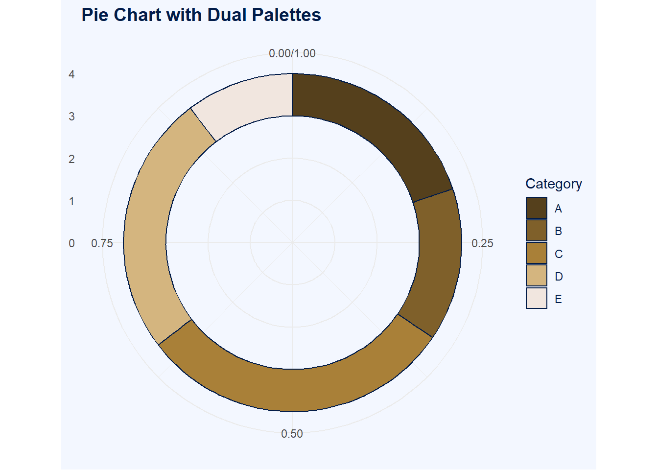
Plot with Primary & Secondary Work Palettes to Create Contrasts:
library(ggplot2)

# Example data
data <- data.frame(
  category = c("A", "B", "C", "D", "E"),
  value = c(23, 17, 35, 29, 12)
)

# Compute cumulative positions for slices
data$fraction <- data$value / sum(data$value)
data$ymax <- cumsum(data$fraction)
data$ymin <- c(0, head(data$ymax, n=-1))

# Theme palette
work_viridis <- colorRampPalette(c("#021C49","#1F3657","#3C5C7C",
                                   "#7FA0C0", "#E9EEF3", "#F3F7FF"))
theme_colors <- work_viridis(256)
bg_light <- theme_colors[256]   # light background
line_dark <- theme_colors[1]  # dark outlines and text

# Pie slice palette
work2_viridis <- colorRampPalette(c("#55401C", "#7f602A", "#A98038","#D4B57F","#F1E6Df"))
slice_colors <- work2_viridis(nrow(data))  # one color per slice

# Pie Chart with dual palettes
ggplot(data, aes(ymax = ymax, ymin = ymin, xmax = 4, xmin = 3, fill = category)) +
  geom_rect(color = line_dark) +               # slice outlines
  coord_polar(theta = "y") +                   # polar coordinates for pie
  scale_fill_manual(values = slice_colors) +   # slices use work2_viridis
  xlim(c(0, 4)) +
  labs(
    title = "Pie Chart with Dual Palettes",
    fill = "Category"
  ) +
  theme_minimal() +
  theme(
    plot.background = element_rect(fill = bg_light, color = NA),
    panel.background = element_rect(fill = bg_light, color = NA),
    plot.title = element_text(color = line_dark, size = 14, face = "bold"),
    legend.title = element_text(color = line_dark),
    legend.text  = element_text(color = line_dark)
  )