Assignment 5
For Assignment 5 I had to create visualization for a data set of my choice through RStudio both with and without ggplot2. The first set of charts where made without ggplot2, the second set was made with ggplot2.
For the data set I chose the Good Shepard Collective’s data set on the destruction of homes and displacement of Palestinians from East Jerusalem and the West Bank since 2009. I chose the data set due to its relevance in current academic discourse and the sure data it enabled me to work with. The link to the data set is here: Home demolitions in the West Bank and East Jerusalem - Good Shepherd Collective.
Below is the chart that best shows the scale of displacement overtime along with its constant consistency.
All other charts, and the code for the one above, are below.
Assignment 5 Part I
Using R without Ggplot2
Histogram
# Histogram of Population
# Load libraries
library(readxl)
library(dplyr)
library(lubridate)

# Load dataset
demo_dataset <- read_excel("C:/Users/marti/OneDrive/Desktop/test/demolition_data_report.xlsx",
                           sheet = "Demolition Report", range = "A1:G2286")

# Optional: convert date to Date type
demo_dataset$date <- as.Date(demo_dataset$date)

# Histogram of people displaced
displaced <- demo_dataset$displacedPeople  # numeric vector
displaced <- na.omit(displaced)            # remove NAs

# Optional: log transform if there are very large values
displaced_log <- log10(displaced + 1)      # add 1 to handle zeros

# Set plot style
par(bg = "bisque", col.axis = "burlywood4", col.lab = "burlywood4", col.main = "burlywood4")

# Plot histogram
hist(displaced_log,
     breaks = 20,                 # number of bins
     col = "burlywood4",
     border = "white",
     main = "Distribution of People Displaced (log10 scale)",
     xlab = "log10(People Displaced + 1)",
     ylab = "Frequency",
     freq = TRUE)                 # set FALSE for density

# Optional: add density line
lines(density(displaced_log), col = "darkred", lwd = 2)
rug(displaced_log, col = "black")  # shows individual points on x-axis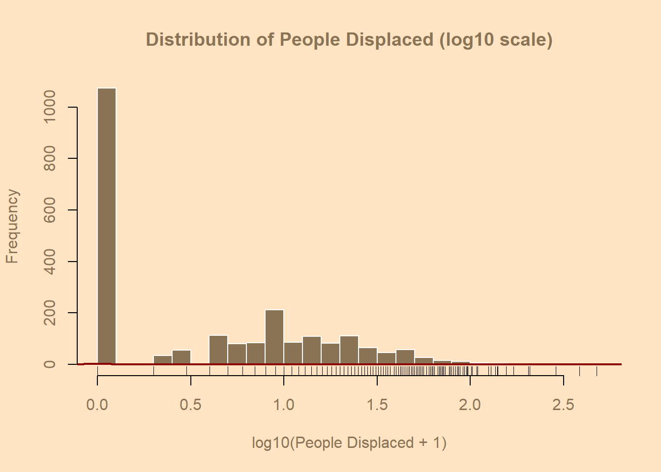
Horizontal Bar Chart
# Load libraries
library(readxl)
library(dplyr)
library(lubridate)

# Read dataset
demo_dataset <- read_excel("C:/Users/marti/OneDrive/Desktop/test/demolition_data_report.xlsx",
                           sheet = "Demolition Report", range = "A1:G2286")
demo <- demo_dataset

# Convert date column and extract year
demo$date <- as.Date(demo$date)
demo$Year <- year(demo$date)

# Summarize total structures destroyed per year
yearly_destruction <- demo %>%
  group_by(Year) %>%
  summarise(Total_Destroyed = sum(structures, na.rm = TRUE)) %>%
  arrange(Year)

# Extract data for plotting
years <- yearly_destruction$Year
totals <- yearly_destruction$Total_Destroyed

# Style setup
par(bg = "bisque", col.axis = "burlywood4", col.lab = "burlywood4", col.main = "burlywood4")

# Horizontal barplot
bar_positions <- barplot(height = totals,
                         names.arg = years,
                         horiz = TRUE,        # <— makes it horizontal
                         col = "burlywood4",
                         border = "white",
                         main = "Total Homes Destroyed by Year",
                         xlab = "Number of Homes Destroyed",
                         ylab = "Year",
                         las = 1,             # keeps year labels horizontal
                         cex.names = 0.8)

# Add numeric labels to the bars
text(x = totals,
     y = bar_positions,
     labels = totals,
     pos = 4,             # 4 = right side of bar
     cex = 0.8,
     col = "black")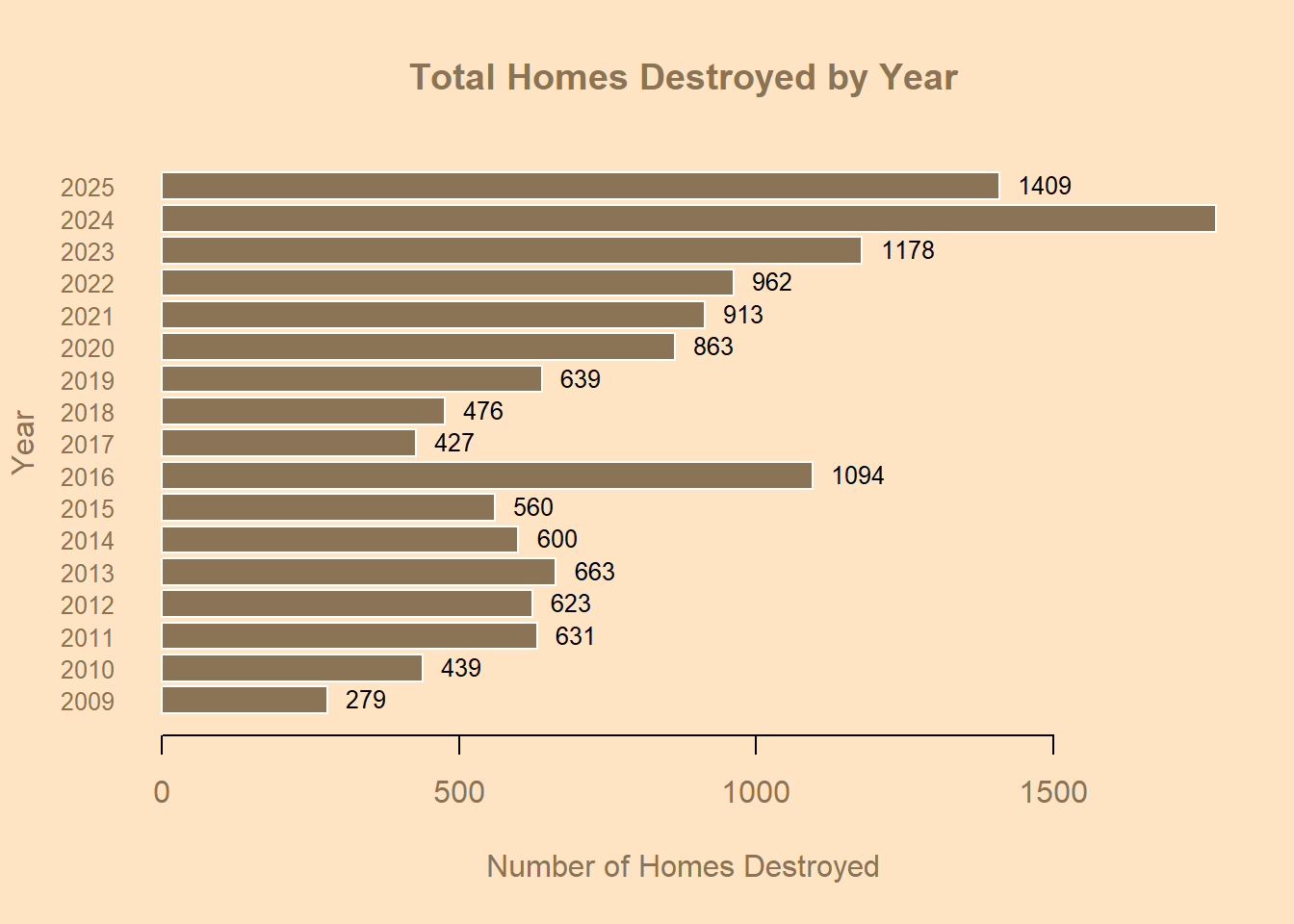
Vertical Bar Chart
# Barplot
library(readxl)
library(dplyr)
library(lubridate)

demo_dataset <- read_excel("C:/Users/marti/OneDrive/Desktop/test/demolition_data_report.xlsx",
                           sheet = "Demolition Report", range = "A1:G2286")
demo <- demo_dataset

# Convert date column to Date type (case-sensitive function name!)
demo$date <- as.Date(demo$date)

# Create a Year column
demo$Year <- year(demo$date)

# Summarize totals by year
yearly_displacement <- demo %>%
  group_by(Year) %>%
  summarise(Total_Displaced = sum(displacedPeople, na.rm = TRUE)) %>%
  arrange(Year)

# Extract data for plotting
years <- yearly_displacement$Year
totals <- yearly_displacement$Total_Displaced

# Set up style
par(bg = "bisque", col.axis = "burlywood4", col.lab = "burlywood4", col.main = "burlywood4")

# Plot
barplot(height = totals,
        names.arg = years,
        col = "burlywood4",
        border = "black",
        main = "W. Bank/E. Jerusalem Palestinians Displaced by year",
        xlab = "Year",
        ylab = "People Displaced",
        las = 2,           # vertical year labels
        cex.names = 0.8)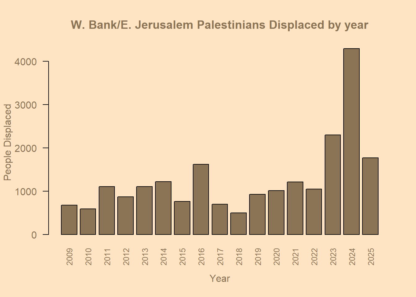
Pie Chart
# Piechart
library(readxl)
demo_dataset <- read_excel("C:/Users/marti/OneDrive/Desktop/test/demolition_data_report.xlsx",
                           sheet = "Demolition Report", range = "A1:G2286")

colnames(demo_dataset)
[1] "date" "incidents" "displacedPeople"
[4] "structures" "menDisplaced" "womenDisplaced"
[7] "childrenDisplaced"head(demo_dataset)# A tibble: 6 × 7
date incidents displacedPeople structures menDisplaced womenDisplaced
<chr> <dbl> <dbl> <dbl> <dbl> <dbl>
1 2009-01-01 1 9 1 4 2
2 2009-01-19 1 20 1 5 5
3 2009-01-28 4 52 11 13 13
4 2009-02-01 1 0 1 0 0
5 2009-02-02 2 0 2 0 0
6 2009-02-03 4 25 11 3 3
# ℹ 1 more variable: childrenDisplaced <dbl># Sum up total displaced people by category
total_men <- sum(demo_dataset$menDisplaced, na.rm = TRUE)
total_women <- sum(demo_dataset$womenDisplaced, na.rm = TRUE)
total_children <- sum(demo_dataset$childrenDisplaced, na.rm = TRUE)
# Combine into a single vector
pie.displacement <- c(Men = total_men,
Women = total_women,
Children = total_children)
pie.displacement Men Women Children
5939 5252 10507 # Set background and margins
par(bg = "bisque", mar = c(2, 2, 2, 2))
# Define colors
cols <- c("deepskyblue3", "orchid3", "gold")
# Plot pie chart
pie(pie.displacement,
labels = names(pie.displacement),
main = "Total People Displaced (Men, Women, and Children)",
col = cols,
border = "white",
cex.main = 1.2,
cex = 0.9)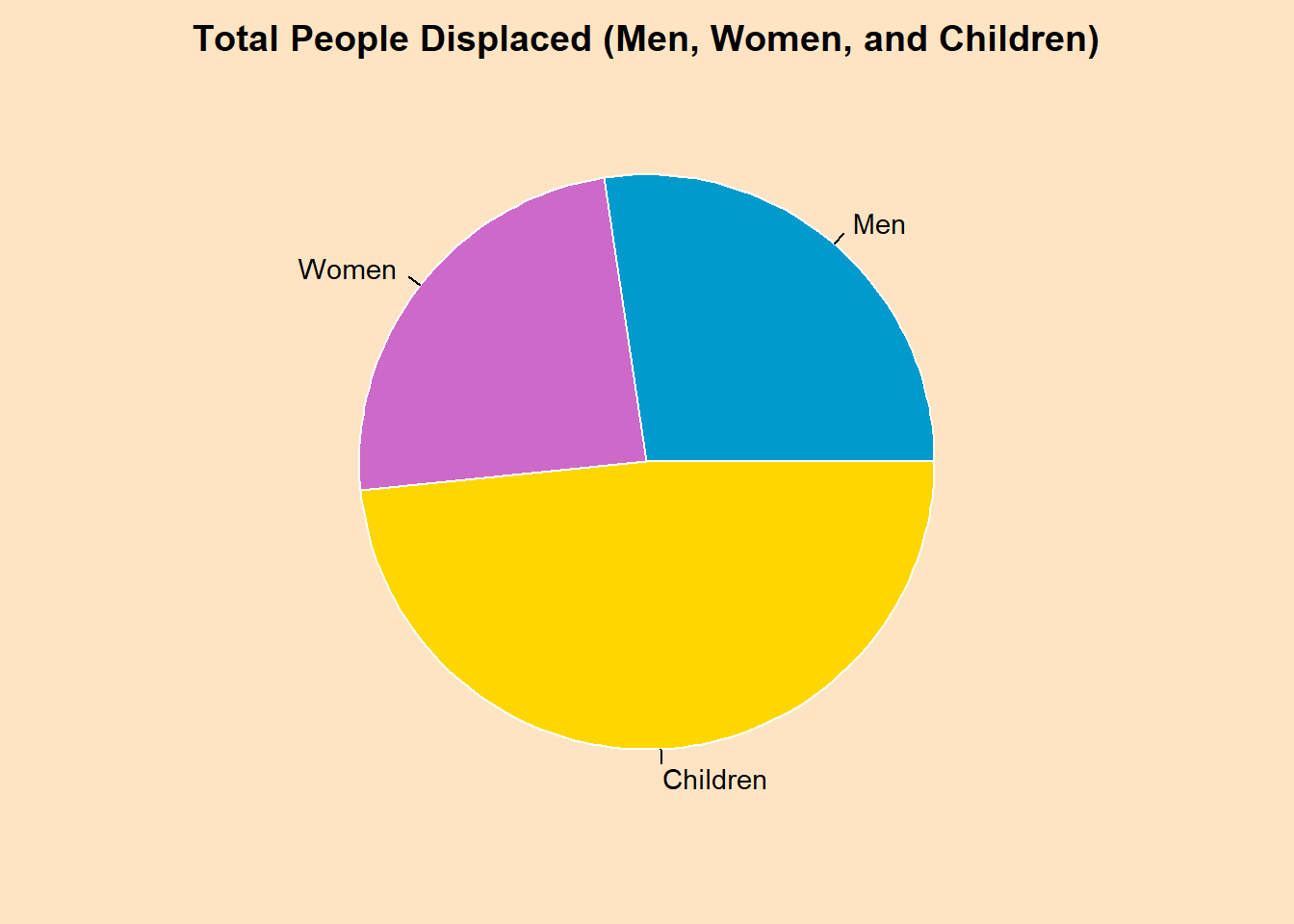
# Add percentages
pct <- round(pie.displacement / sum(pie.displacement) * 100)
lbls <- paste(names(pie.displacement), pct, "%")

pie(pie.displacement,
    labels = lbls,
    main = "W. Bank/E. Jerusalem Palestinians Displaced by Demographic",
    col = cols,
    border = "white",
    cex.main = 1.2,
    cex = 0.9)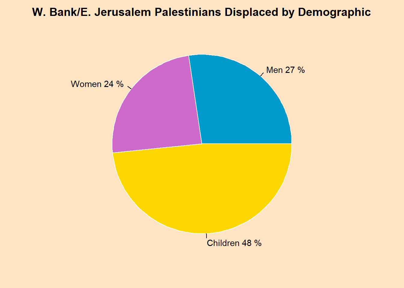
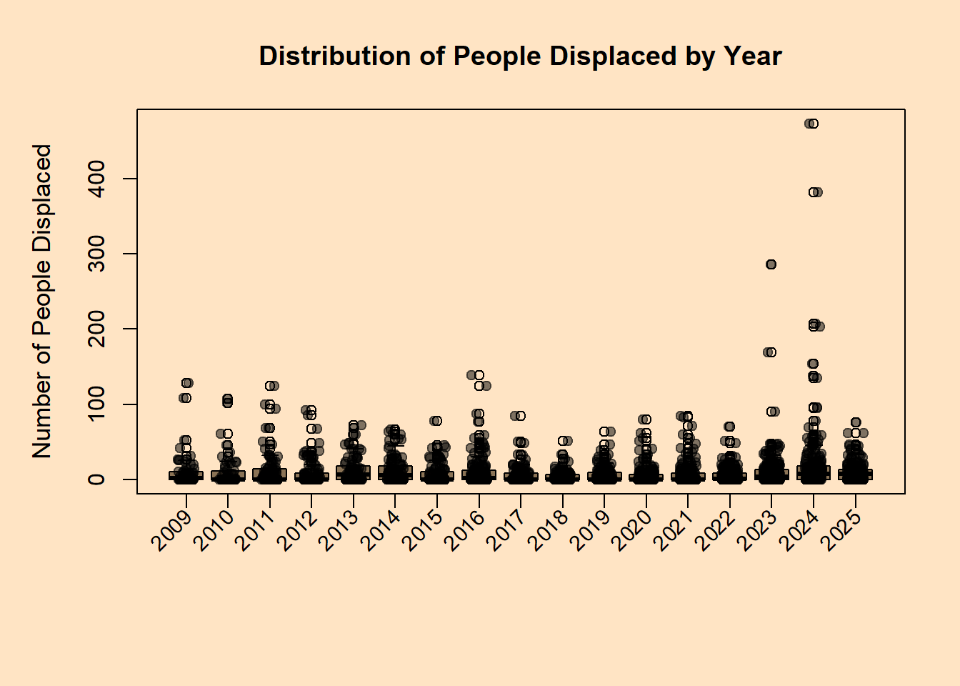
Boxplot
# Load libraries
library(readxl)
library(dplyr)
library(lubridate)

# Load dataset
demo_dataset <- read_excel("C:/Users/marti/OneDrive/Desktop/test/demolition_data_report.xlsx",
                           sheet = "Demolition Report", range = "A1:G2286")

# Convert date to Date type
demo_dataset$date <- as.Date(demo_dataset$date)

# Extract Year
demo_dataset$Year <- year(demo_dataset$date)

# Prepare data for boxplot: displacedPeople by Year
years <- sort(unique(demo_dataset$Year))
box_data <- lapply(years, function(y) demo_dataset$displacedPeople[demo_dataset$Year == y])

# Set up plot style
par(bg = "bisque", mar = c(7, 5, 4, 2))  # extra bottom margin for rotated labels

# Create boxplot
boxplot(box_data,
        names = rep("", length(years)),  # suppress default x-axis labels
        col = "burlywood4",
        border = "black",
        main = "Distribution of People Displaced by Year",
        ylab = "Number of People Displaced",
        cex.main = 1.2,
        cex.lab = 1.1)

# Add rotated x-axis labels
axis(side = 1, at = 1:length(years), labels = FALSE)
text(x = 1:length(years), y = par("usr")[3] - 0.05*diff(par("usr")[3:4]),
     labels = years, srt = 45, adj = 1, xpd = TRUE, cex = 0.9)

# Optional: add jittered points for individual observations
set.seed(123)  # reproducible jitter
for (i in seq_along(box_data)) {
  points(jitter(rep(i, length(box_data[[i]])), amount = 0.2),
         box_data[[i]],
         pch = 19,
         col = adjustcolor("black", alpha.f = 0.5))
}
Scatterplot
# Load libraries
library(readxl)
library(dplyr)

# Read your dataset
demo_dataset <- read_excel("C:/Users/marti/OneDrive/Desktop/test/demolition_data_report.xlsx",
                           sheet = "Demolition Report", range = "A1:G2286")

# Convert date column to Date type
demo_dataset$date <- as.Date(demo_dataset$date)

# Summarize by date (in case there are multiple rows per date)
daily_displacement <- demo_dataset %>%
  group_by(date) %>%
  summarise(Total_Displaced = sum(displacedPeople, na.rm = TRUE)) %>%
  arrange(date)

# Set up style
par(bg = "bisque", col.axis = "burlywood4", col.lab = "burlywood4", col.main = "burlywood4")

# Base R scatterplot
plot(daily_displacement$date,
     daily_displacement$Total_Displaced,
     type = "p",                   # 'p' = points
     pch = 19,                     # solid circles
     col = "burlywood4",
     main = "People Displaced Over Time",
     xlab = "Date",
     ylab = "Total People Displaced")

# Optionally add a trend line
lines(lowess(daily_displacement$date, daily_displacement$Total_Displaced),
      col = "darkred", lwd = 2)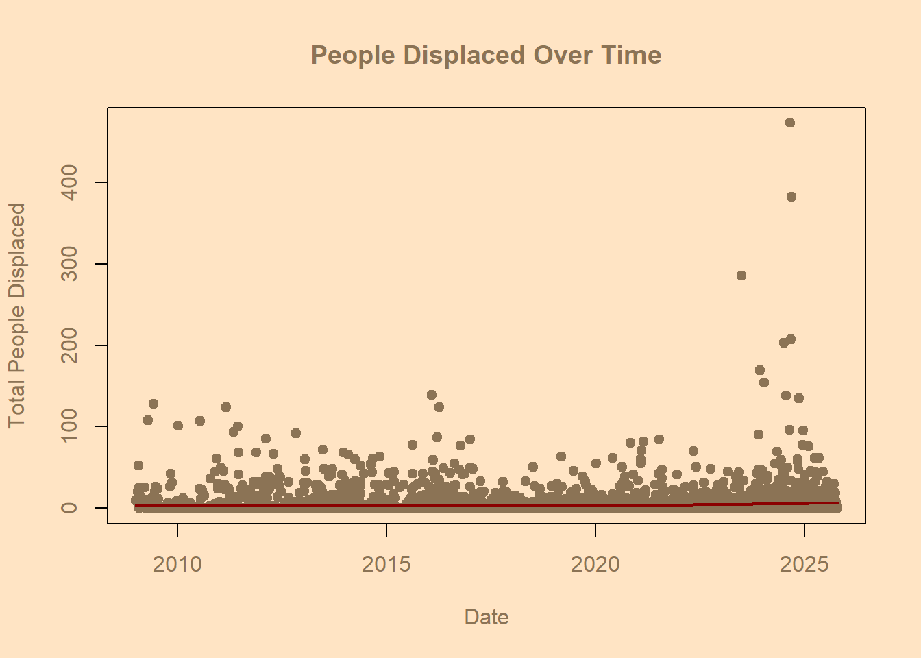
Assignment 5 Part II
Using Ggplot 2
Histogram
library(readxl)
library(dplyr)
library(lubridate)
library(ggplot2)

# Load dataset
demo_dataset <- read_excel("C:/Users/marti/OneDrive/Desktop/test/demolition_data_report.xlsx",
                           sheet = "Demolition Report", range = "A1:G2286")

# Convert date to Date type
demo_dataset$date <- as.Date(demo_dataset$date)

# Extract Year
demo_dataset$Year <- lubridate::year(demo_dataset$date)

# Remove NAs
demo_dataset <- demo_dataset %>% filter(!is.na(displacedPeople))

# Generate greyscale colors for the years
grey_colors <- gray(seq(0.2, 0.8, length.out = length(unique(demo_dataset$Year))))

# Plot stacked histogram in greyscale
ggplot(demo_dataset, aes(x = displacedPeople, fill = factor(Year))) +
  geom_histogram(binwidth = 10, color = "white", position = "stack") +
  scale_fill_manual(values = grey_colors) +
  scale_x_log10() +   # optional: log10 scale for skewed data
  labs(
    title = "Distribution of People Displaced by Year",
    x = "People Displaced (log10 scale)",
    y = "Count",
    fill = "Year"
  ) +
  theme_minimal(base_size = 14) +
  theme(
    panel.background = element_rect(fill = "bisque"),
    plot.background = element_rect(fill = "bisque"),
    axis.text = element_text(color = "burlywood4"),
    axis.title = element_text(color = "burlywood4"),
    plot.title = element_text(color = "burlywood4", hjust = 0.5),
    legend.title = element_text(color = "burlywood4"),
    legend.text = element_text(color = "burlywood4")
  )
Warning in scale_x_log10(): log-10 transformation introduced infinite values.Warning: Removed 1073 rows containing non-finite outside the scale range
(`stat_bin()`).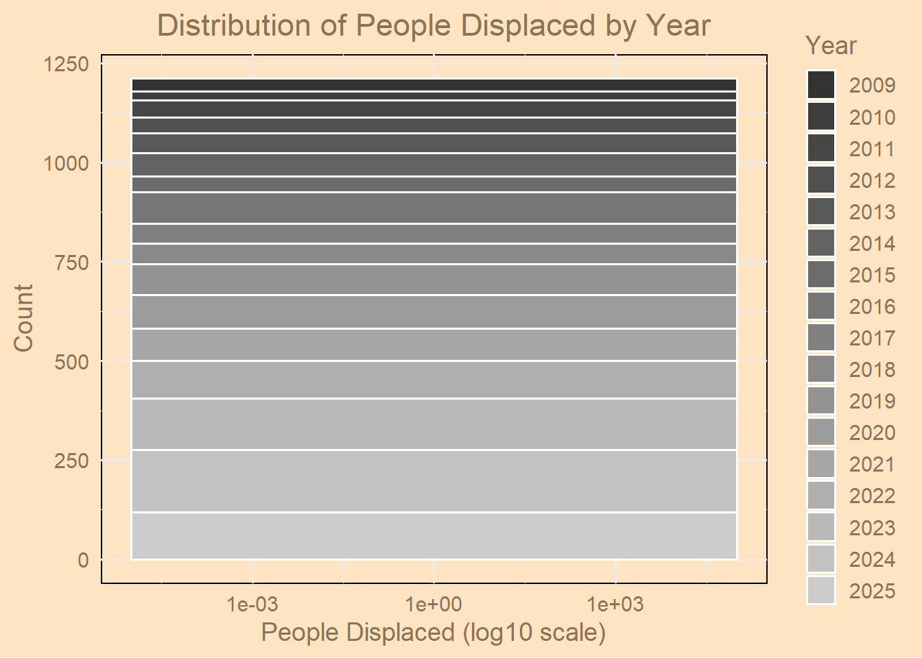
Horizontal Bar Chart
library(readxl)
library(dplyr)
library(lubridate)
library(ggplot2)

# Load the dataset
demo_dataset <- read_excel("C:/Users/marti/OneDrive/Desktop/test/demolition_data_report.xlsx",
                           sheet = "Demolition Report", range = "A1:G2286")

# Convert to date and extract year
demo_dataset$date <- as.Date(demo_dataset$date)
demo_dataset$Year <- year(demo_dataset$date)

# Summarize destroyed homes (structures) per year
yearly_structures <- demo_dataset %>%
  group_by(Year) %>%
  summarise(Total_Structures = sum(structures, na.rm = TRUE)) %>%
  arrange(Year)

# Convert Year to an ordered factor
yearly_structures$Year <- factor(yearly_structures$Year, levels = yearly_structures$Year)

# Plot horizontal bar chart
ggplot(yearly_structures, aes(x = Total_Structures, y = Year)) +
  geom_bar(stat = "identity", fill = "burlywood4") +
  labs(
    title = "Total Structures Destroyed by Year",
    x = "Structures Destroyed",
    y = "Year"
  ) +
  theme_minimal(base_size = 14) +
  theme(
    panel.background = element_rect(fill = "bisque", color = NA),
    plot.background = element_rect(fill = "bisque"),
    axis.title = element_text(color = "burlywood4"),
    axis.text = element_text(color = "burlywood4"),
    plot.title = element_text(color = "burlywood4", hjust = 0.5)
  ) +
  # Expand the x-axis to add more space to the right
  scale_x_continuous(expand = expansion(mult = c(0, 0.1)))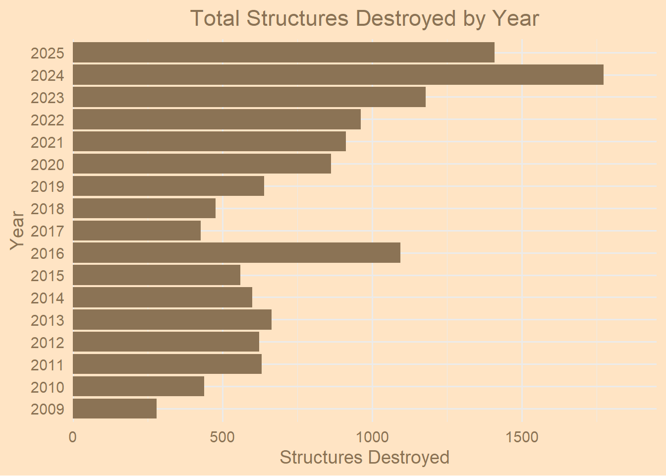
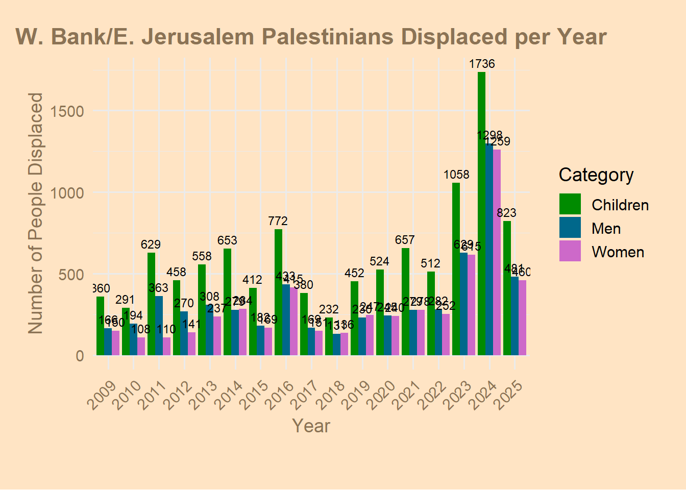
Vertical Bar Chart
# Barplot
library(readxl)
demo_dataset <- read_excel("C:/Users/marti/OneDrive/Desktop/test/demolition_data_report.xlsx",
    sheet = "Demolition Report", range = "A1:G2286")
demo <- demo_dataset

colnames(demo)
[1] "date" "incidents" "displacedPeople"
[4] "structures" "menDisplaced" "womenDisplaced"
[7] "childrenDisplaced"library(lubridate)
library(dplyr)
# Convert 'date' column to Date type
demo$Date <- as.Date(demo$date, format = "%Y-%m-%d") # adjust format if needed
# Extract the year
demo$Year <- year(demo$Date)
# Check that it worked
str(demo$Date) Date[1:2285], format: "2009-01-01" "2009-01-19" "2009-01-28" "2009-02-01" "2009-02-02" ...head(demo$Year)[1] 2009 2009 2009 2009 2009 2009demo$Date <- as.Date(demo$date, format = "%m/%d/%Y")
library(tidyr)Warning: package 'tidyr' was built under R version 4.5.2# Summarize total displaced by category per year
yearly_displacement <- demo %>%
group_by(Year) %>%
summarise(
Men = sum(menDisplaced, na.rm = TRUE),
Women = sum(womenDisplaced, na.rm = TRUE),
Children = sum(childrenDisplaced, na.rm = TRUE)
) %>%
pivot_longer(cols = c(Men, Women, Children),
names_to = "Category",
values_to = "Count")
yearly_displacement# A tibble: 51 × 3
Year Category Count
<dbl> <chr> <dbl>
1 2009 Men 166
2 2009 Women 150
3 2009 Children 360
4 2010 Men 194
5 2010 Women 108
6 2010 Children 291
7 2011 Men 363
8 2011 Women 110
9 2011 Children 629
10 2012 Men 270
# ℹ 41 more rowslibrary(ggplot2)
options(repr.plot.width = 40, repr.plot.height = 6)
ggplot(yearly_displacement, aes(x = factor(Year), y = Count, fill = Category)) +
geom_col(position = "dodge") +
geom_text(aes(label = Count),
position = position_dodge(width = 0.9),
vjust = -0.5, size = 3, color = "black") +
scale_fill_manual(values = c("green4", "deepskyblue4", "orchid3")) +
theme_minimal(base_size = 14) +
theme(
plot.background = element_rect(fill = "bisque", color = NA),
panel.background = element_rect(fill = "bisque", color = NA),
axis.text = element_text(color = "burlywood4"),
axis.text.x = element_text(angle = 45, hjust = 1, color = "burlywood4"),
axis.title = element_text(color = "burlywood4"),
plot.title = element_text(color = "burlywood4", face = "bold", hjust = 0.5),
plot.margin = margin(20, 20, 40, 20)
) +
labs(
title = "W. Bank/E. Jerusalem Palestinians Displaced per Year",
x = "Year",
y = "Number of People Displaced",
fill = "Category"
)
Pie Chart
# Piechart
library(readxl)
demo_dataset <- read_excel("C:/Users/marti/OneDrive/Desktop/test/demolition_data_report.xlsx",
                           sheet = "Demolition Report", range = "A1:G2286")

colnames(demo_dataset)
[1] "date" "incidents" "displacedPeople"
[4] "structures" "menDisplaced" "womenDisplaced"
[7] "childrenDisplaced"head(demo_dataset)# A tibble: 6 × 7
date incidents displacedPeople structures menDisplaced womenDisplaced
<chr> <dbl> <dbl> <dbl> <dbl> <dbl>
1 2009-01-01 1 9 1 4 2
2 2009-01-19 1 20 1 5 5
3 2009-01-28 4 52 11 13 13
4 2009-02-01 1 0 1 0 0
5 2009-02-02 2 0 2 0 0
6 2009-02-03 4 25 11 3 3
# ℹ 1 more variable: childrenDisplaced <dbl># Sum up total displaced people by category
total_men <- sum(demo_dataset$menDisplaced, na.rm = TRUE)
total_women <- sum(demo_dataset$womenDisplaced, na.rm = TRUE)
total_children <- sum(demo_dataset$childrenDisplaced, na.rm = TRUE)
# Combine into a single vector
pie.displacement <- c(Men = total_men,
Women = total_women,
Children = total_children)
pie.displacement Men Women Children
5939 5252 10507 library(ggplot2)
df <- data.frame(
Category = c("Men", "Women", "Children"),
Count = c(total_men, total_women, total_children)
)
ggplot(df, aes(x = "", y = Count, fill = Category)) +
geom_bar(stat = "identity", width = 1) +
coord_polar("y", start = 0) +
theme_void() +
scale_fill_manual(values = c("deepskyblue3", "orchid3", "gold")) +
labs(title = "Proportion of People Displaced by Demographic")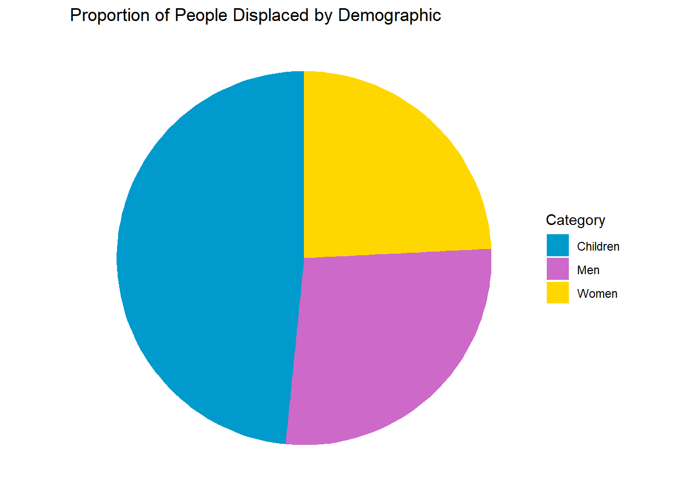
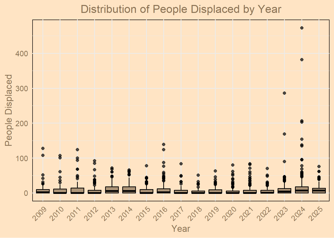
Boxplot
library(readxl)
library(dplyr)
library(lubridate)
library(ggplot2)

# Load dataset
demo_dataset <- read_excel("C:/Users/marti/OneDrive/Desktop/test/demolition_data_report.xlsx",
                           sheet = "Demolition Report", range = "A1:G2286")

# Convert date to Date and extract year
demo_dataset$date <- as.Date(demo_dataset$date)
demo_dataset$Year <- lubridate::year(demo_dataset$date)

# Boxplot of displacedPeople by Year
ggplot(demo_dataset, aes(x = factor(Year), y = displacedPeople)) +
  geom_boxplot(fill = "burlywood4", color = "black", alpha = 0.7) +
  labs(
    title = "Distribution of People Displaced by Year",
    x = "Year",
    y = "People Displaced"
  ) +
  theme_minimal(base_size = 14) +
  theme(
    plot.background = element_rect(fill = "bisque"),
    panel.background = element_rect(fill = "bisque"),
    axis.text = element_text(color = "burlywood4"),
    axis.title = element_text(color = "burlywood4"),
    plot.title = element_text(color = "burlywood4", hjust = 0.5),
    axis.text.x = element_text(angle = 45, hjust = 1)   # rotate x-axis labels
  )
Scatterplot
install.packages("plotly", repos = "https://cloud.r-project.org/")Warning: package 'plotly' is in use and will not be installedlibrary(readxl)
library(dplyr)
library(lubridate)
library(ggplot2)
library(plotly)
# Load dataset
demo_dataset <- read_excel("C:/Users/marti/OneDrive/Desktop/test/demolition_data_report.xlsx",
sheet = "Demolition Report", range = "A1:G2286")
# Convert date column to Date type
demo_dataset$date <- as.Date(demo_dataset$date)
# Ensure 'incidents' column is numeric
demo_dataset$incidents <- as.numeric(demo_dataset$incidents)
# Summarize by date
daily_displacement <- demo_dataset %>%
group_by(date) %>%
summarise(
Total_Displaced = sum(displacedPeople, na.rm = TRUE),
Total_Incidents = sum(incidents, na.rm = TRUE)
) %>%
arrange(date)
# Build ggplot object
p <- ggplot(daily_displacement, aes(x = date, y = Total_Displaced,
size = Total_Incidents,
text = paste("Date:", date,
"<br>Total Displaced:", Total_Displaced,
"<br>Incidents:", Total_Incidents))) +
geom_point(color = "burlywood4", alpha = 0.7) +
geom_smooth(method = "loess", se = FALSE, color = "darkred") +
scale_size_area(max_size = 12) + # size of bubbles
labs(
title = "W. Bank/E. Jerusalem Palestinians Displaced Over Time",
subtitle = "Bubble size = Number of incidents",
x = "Date",
y = "Total People Displaced",
size = "Incidents"
) +
theme_minimal(base_size = 14) +
theme(
panel.background = element_rect(fill = "bisque", color = NA),
plot.background = element_rect(fill = "bisque"),
axis.title = element_text(color = "burlywood4"),
axis.text = element_text(color = "burlywood4"),
plot.title = element_text(color = "burlywood4", hjust = 0.5),
plot.subtitle = element_text(color = "burlywood4", hjust = 0.5)
)
# Convert to interactive Plotly plot
ggplotly(p, tooltip = "text")`geom_smooth()` using formula = 'y ~ x'