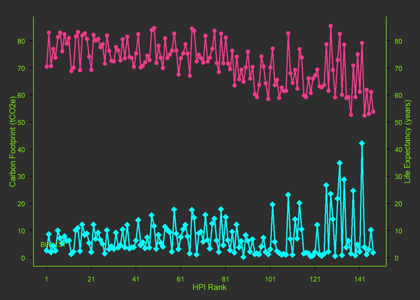
colnames(hpi) <- make.names(colnames(hpi))
x <- hpi$`HPI.rank` # chose to compare HPI rank to a few other factors
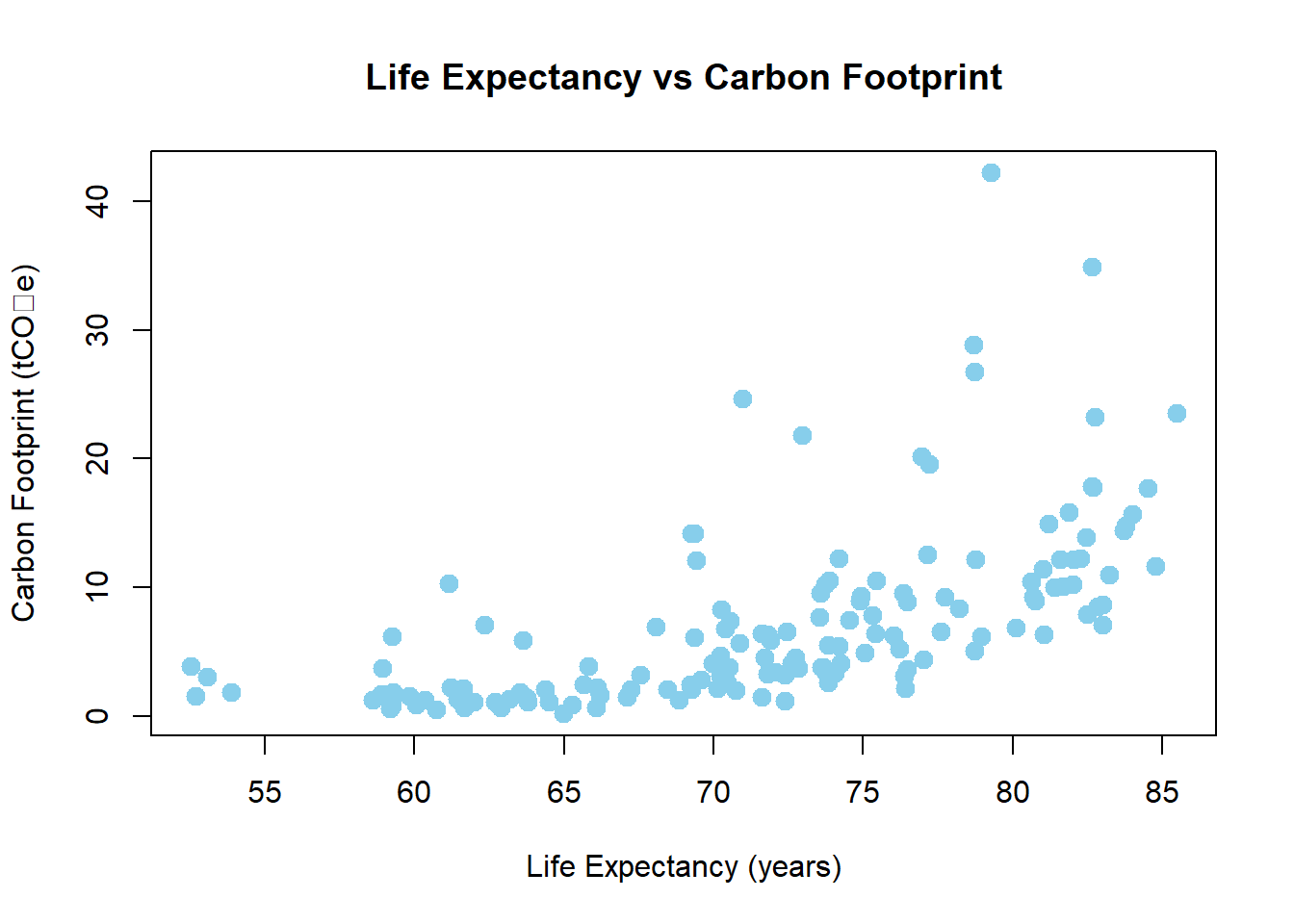
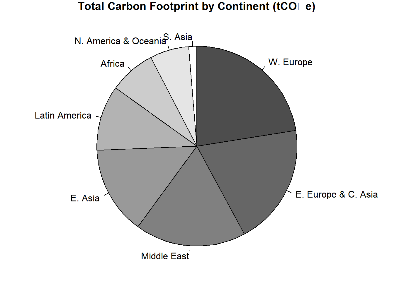
y1 <- hpi$`Carbon.Footprint..tCO2e.` # testing for correlation.
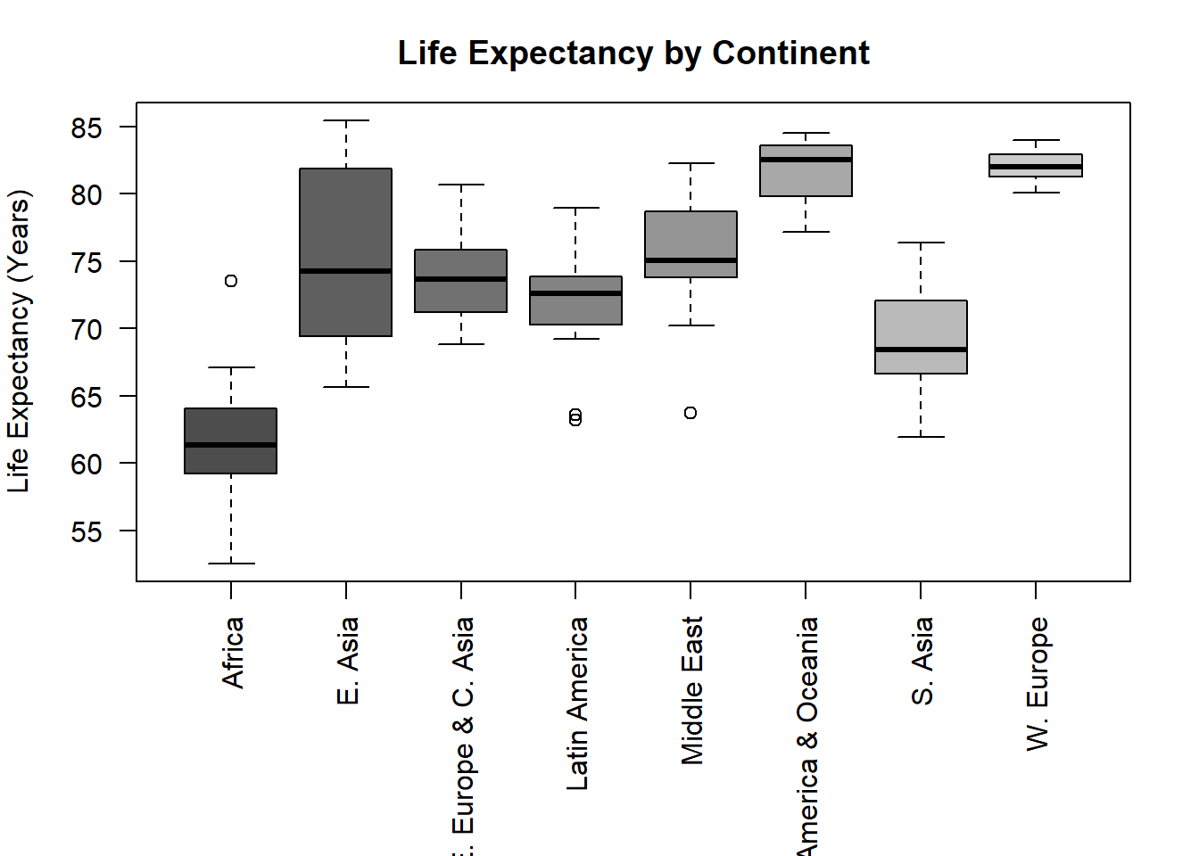
y2 <- hpi$`Life.Expectancy..years.` # testing for correlation.
# Setting label orientation, margins c(bottom, left, top, right) & text size
par(las=1, mar=c(4, 4, 2, 4), cex=.7, bg = "grey18")
plot.new()
plot.window(range(x, na.rm=TRUE), range(c(y1, y2), na.rm=TRUE))
# What is the first number standing for? The Bottom Axis.
# X-axis based on HPI rank
axis(1, at=seq(min(x, na.rm=TRUE), max(x, na.rm=TRUE), by=20), col.axis = "chartreuse2")
# Y-axes based on the combined range of y1 and y2
axis(2, at=seq(0, 90, by=10), col.axis = "chartreuse2")
axis(4, at=seq(0, 90, by=10), col.axis = "chartreuse2")
lines(x, y1, col="cyan1", lwd=2)
lines(x, y2, col="violetred2", lwd=2)
points(x, y1, pch=18, cex=2, col="cyan1") # Try different cex value? I did not like any othercex value, so I just changed the pch instead.
points(x, y2, pch=20, bg="chartreuse2", cex=2, col="violetred2") # Changed background color to grey18.
par(col="chartreuse2", fg= "chartreuse2", col.axis="chartreuse2")
box(bty="u")
mtext("HPI Rank", side=1, line=2, cex=0.8)
mtext("Carbon Footprint (tCO2e)", side=2, line=2, las=0, cex=0.8)
mtext("Life Expectancy (years)", side=4, line=2, las=0, cex=0.8)
text(4, 5, "Bird 131")