Assignment 1
September 24th, 2025
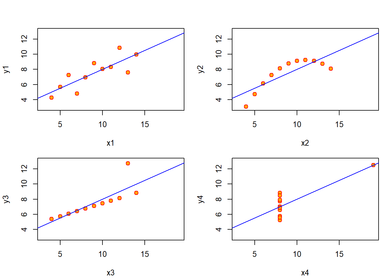
1.1 Anscombe’s Examples
Anscombe, F. J. (1973). Graphs in Statistical Analysis. The American Statistician, 27(1), 17–21. https://doi.org/10.2307/2682899
Anscombe believes that data visualization can be a powerful tool to make breakthroughs in exploratory data analysis and should not just be limited to the presentation of findings. Instead, Anscombe showcases through these four graphs how the visualization of datasets can help a researcher diagnosis outliers, pattern and correlation recognition, alongside the detection of missing data and/or poor data quality. Visualizations take advantage of the human eyes natural capacity for pattern recognition that is diminished by the overwhelming nature of raw data. In order to implement visualizations to optimize the workflow of a team of analyst, it is essential to build data visualization skills either across the team or have a member of the team specialize in data visualization to improve exploratory data analysis and research.
1.2 Fall.R: Firebrick Leaf

1.3 A Critique of an NC State Infographic on Disability Status and Age
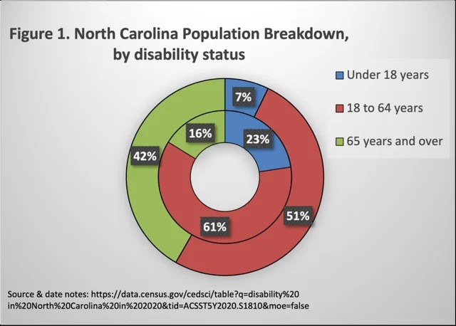
I stumbled upon this pie chart on an internet thread of analysts discussing bad and/or dishonest charts. Although not the most atrocious chart when it comes to malice or misinformation, this pie chart out about North Carolina’s disabled population was most definitely the most confusing. Although one can assume that those 65 and older would make up a disproportionately larger part of the population, having the disabled population represented by the out pie chart causes confusion. The disabled population is most definitely smaller than the total population of North Carolina’s total population, yet the disabled population represents the larger outside rim of the chart. To the eye, it would seem intuitive that the outer rim would of represented the total population, and no where in the graphic is there any labels that could prevent this false assumption. It is only while reading the Smith’s corresponding article that one would gain the context necessary to properly read the pie chart. Infographics should be able to tell a story on their own, with corresponding written information merely deepening the understanding a viewer already had of the information conveyed in the infographic.